
Let’s be honest: people don’t read websites anymore. They scan, they swipe, they scroll like their thumbs are training for the Olympics. And if your design doesn’t grab their attention faster than a toddler spots a cookie, you’ve already lost them.
We’re living in the ‘Attention Deficit Era.’ Every app, ad, and inbox ping is screaming, “LOOK AT ME!” So how do you make a design that doesn’t just look pretty but actually gets noticed, and more importantly, keeps people around long enough to do something useful?
That’s what this article is about: how to design for people whose attention spans have been absolutely fried by TikTok, email, Slack, and that one friend who only sends voice notes.
1. First, embrace the scroll culture

Every Pixel Is a Choice
People don’t mind scrolling. In fact, they love it. What they hate is hunting for what they need. Make scrolling rewarding.
Start with a strong, clear headline. Not clever. Not mysterious. Clear. You’re not writing poetry; you’re trying to get someone to care about your design.
Bad copy: “Empower your workflow synergy”
Good copy: “Make better designs in half the time”
The second one tells you what to expect and why you should keep reading. The first one sounds like it was generated by a buzzword blender.
2. Visual hierarchy: the secret sauce
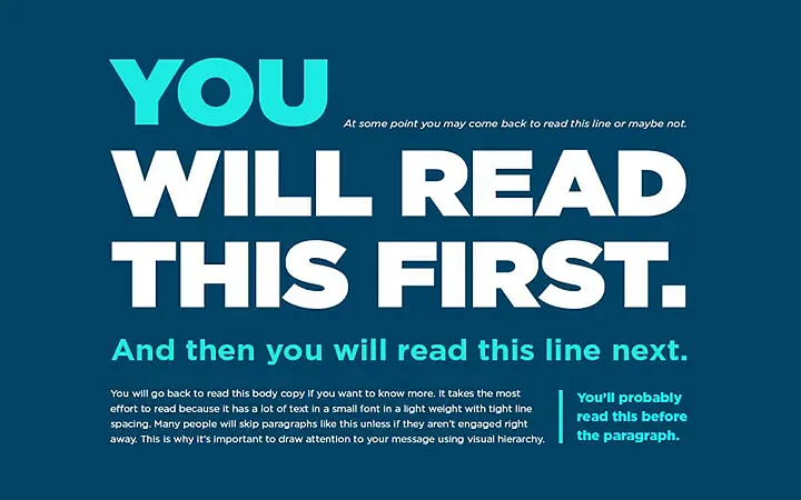
Imagine your layout is a room, and you want to guide someone through it without shouting. That’s what good visual hierarchy does.
Use font size, weight, spacing, and color to signal importance. Big, bold headlines. Clear subheadings. Short paragraphs.
And white space? White space is breathing room. Don’t cram. Your users’ brains are tired. Let them relax
3. One job per screen
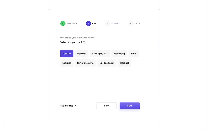
Each screen or section should ask your user to do one thing. Not three. Not eight. One.
Are they signing up? Reading a review? Buying a sweater? Make that single action the star of the show.
You know that moment when you open a site and it’s like being slapped by five popups at once? Yeah, don’t be that guy.
4. Make interactions instant and obvious
When someone clicks, taps, or scrolls, there should be immediate feedback. This tells their brain, “Yes, the thing you did worked.”
Hover effects, button animations, loading indicators are all tiny things, but they reassure the user that they’re not just shouting into the void.
5. Keep text bite-sized

Avoid giant walls of text. Break it up. Use bullet points. Add headings. Write like you’re texting a smart friend.
Use short sentences.
Use real words, not jargon.
Cut anything that doesn’t help the user.
If you can say it in three words instead of twelve, do it.
6. “Don’t make me think”
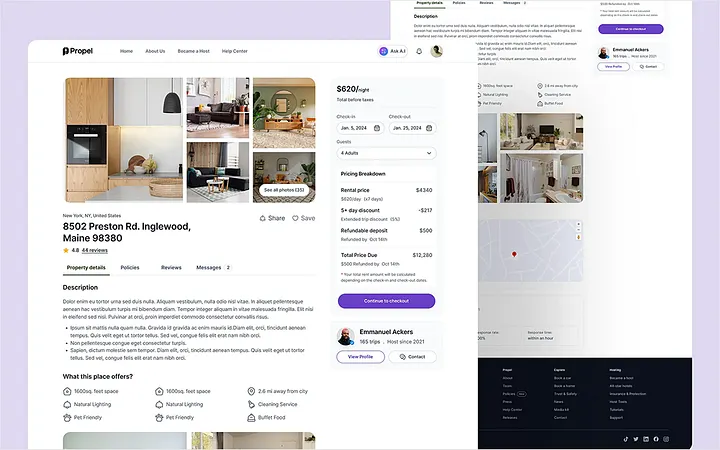
This classic principle is more relevant than ever. Good design makes decisions for the user.
They shouldn’t have to guess which button to press. They shouldn’t be wondering if “Sign Up” and “Register” are the same thing. Be consistent. Be predictable.
Predictable doesn’t mean boring. It means clear.
7. Microcopy: small words, big impact
That tiny text on buttons, forms, and error messages? It matters. A lot.
Instead of saying “Submit,” say what will happen: “Get My Report.” Instead of “404 Error,” say “Oops, that page isn’t here. Try going back.”
These little touches guide the user and make your design feel human. Like it was made by someone who actually uses the internet.
8. Use real-world patterns
There’s a reason buttons usually go on the bottom right. Or that clicking a logo takes you home. These are conventions, and your job isn’t to fight them.
Your job is to use them so users don’t get confused. The more time they spend figuring out how to use your site, the less time they spend actually using it.
9. Test on your distracted friends
Don’t test your designs with other designers. Test with someone who’s busy, tired, and halfway through lunch. That’s your real user.
Can they figure out what to do in the first 5 seconds? Can they find the thing they came for? Can they use your form without throwing their phone?
If the answer is no, back to the drawing board.
10. Keep mobile in mind
Most users are seeing your design on a phone. A small phone. With one hand. While they’re half-watching Netflix.
Make tap targets big.
Use clear typography.
Don’t cram ten things into a single screen.
And test on real devices. Emulators lie.
11. Delight, but don’t distract
A subtle animation? Delightful. A loading bar with a joke in it? Love that.
But anything that slows users down unnecessarily? That’s just annoying.
Design can have personality. It should. But not at the expense of usability. Your interface shouldn’t feel like it’s trying too hard to be cool.
12. Think of UX like a good joke
Setup, timing, payoff. That’s a joke. That’s also good UX.
You set up a clear expectation. You guide users to the punchline (action). And if they get there without friction, they leave smiling.
Get in, deliver value, get out. Don’t overstay your welcome.
To summarize
Designing for short attention spans is about:
Clarity over cleverness
Speed over sparkle
Familiarity over novelty
Real words over buzzwords
And most of all, empathy. Empathy for the user who’s tired, distracted, and just wants to get stuff done.
#UI Design #UX Design #Design Psychology #UI #UX